By Robert McLachlan
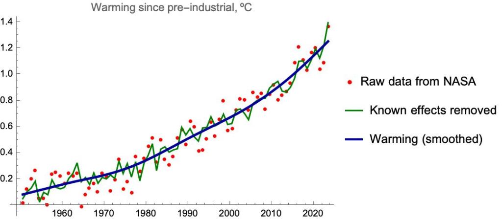
Here are the annual average temperatures relative to pre-industrial times, as measured by NASA.

2023 clocked in at +1.40 ºC.
There’s quite a lot of variation from year to year. Some of this is fairly well understood. Large volcanoes like Pinatubo (1992) cool the air for a year or two; The El Nino/La Nina oscillation alternately and irregularly warms and cools the air, as heat is transferred in and out of the ocean; and the 11-year solar cycle also contributes. Together these account for about half of the fluctuations – they are typically around ±0.08 ºC but can be up to ±0.2 ºC.
Recently, a well-known statistician updated an earlier study in which these known effects are subtracted out to reveal the underlying global warming signal:

He ends his analysis with the understated comment that “it appears that the rate of global warming has increased”.
What does the global warming signal look like if we remove the rest of the fluctuations? Here’s what I get:
And with the smoothed signal only:
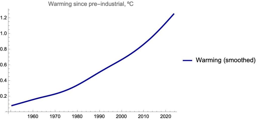
The underlying rate of warming is about 0.08 ºC per decade in the 1950s and 60s. It rises to 0.15 ºC per decade in the 1980s and 90s. In the past decade it has averaged +0.30 ºC per decade. The underlying trend value for 2023 is +1.25 ºC, meaning that if there is no further change in the trend, 1.5 ºC will be breached in 8 years.
There are a lot of contributors to the warming, but atmospheric CO2 is the main one. Here is the underlying warming trend shown together with the (scaled) level of atmospheric CO2:
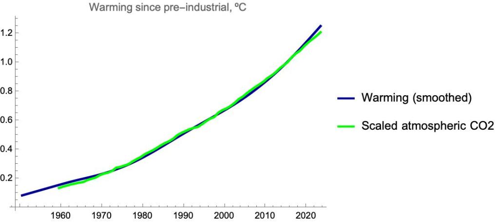

Excellent, simple, easy to understand, and terrifying.
Time to stay home, garden, make jam, read a book.
Perhaps if the “The Age of Stupid” can give way to “The Age of Frugal” we (the collective, including all current passenger species on planet Earth) will have a fighting chance.
The last chart with the scaled atmospheric co2 concentration suggests that warming follows co2 immediately. In other words: one would expect that if atmospheric co2 would be constant from a certain time on, warming would immediately halt.
However, co2 emissions indeed accelerated over decades, but this acceleration ended a couple of years ago. Therefore, if warming would immediately follow, one would expect that it slows down. But exactly now, when from nearly constant annual co2 emissions one would expect a linear warming, on the contrary, its acceleration is documented.
My question therefore: can the match between atmospheric co2 and temerparture even be improved with a different scaling and a translation in time? Could this be a method to test the time lag and hence make at least a guess how much warming is to be expected even if the world has decarbonised?
https://www.carbonbrief.org/analysis-global-co2-emissions-could-peak-as-soon-as-2023-iea-data-reveals/
Good question. Michael Mann argues that the warming “commitment” is zero – if we stopped emitting CO2, warming would stop almost immediately. Heat released from the oceans would be balanced by the oceans taking up CO2. https://www.livescience.com/planet-earth/climate-change/yes-we-can-still-stop-the-worst-effects-of-climate-change-heres-why
The acceleration in warming dates from around 2010 while the apparent linear increase in atmospheric CO2 is more recent. But I expect that if in the next 10 years, say, emissions did not increase, and even decreased somewhat, we would be able to detect and end to the acceleration.
Methane is very important too, so I suspect the very, very close match with CO2 is something of a coincidence – other effects have cancelled out. At the moment atmospheric methane is increasing sharply, if emissions can be reduced we will see a positive effect very quickly.