On 6 February, 2018 average temperatures were released by most of the major providers. Harry Stevens at Axios has made a compelling spinnable globe comparing temperatures before and after 1970. A snapshot of the northern hemisphere:

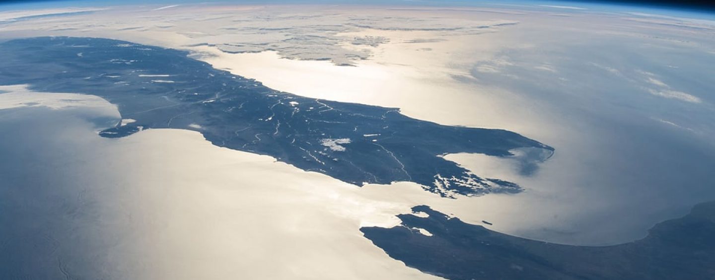
And the southern hemisphere, particularly striking when you live in New Zealand, which has already seen 1°C of warming since 1910:
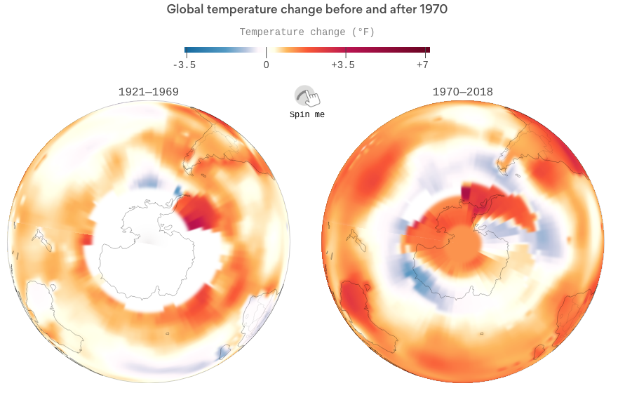
Go on, give it a spin!
Robert McLachlan
